Work Juniper Front Credit Union
It works now.
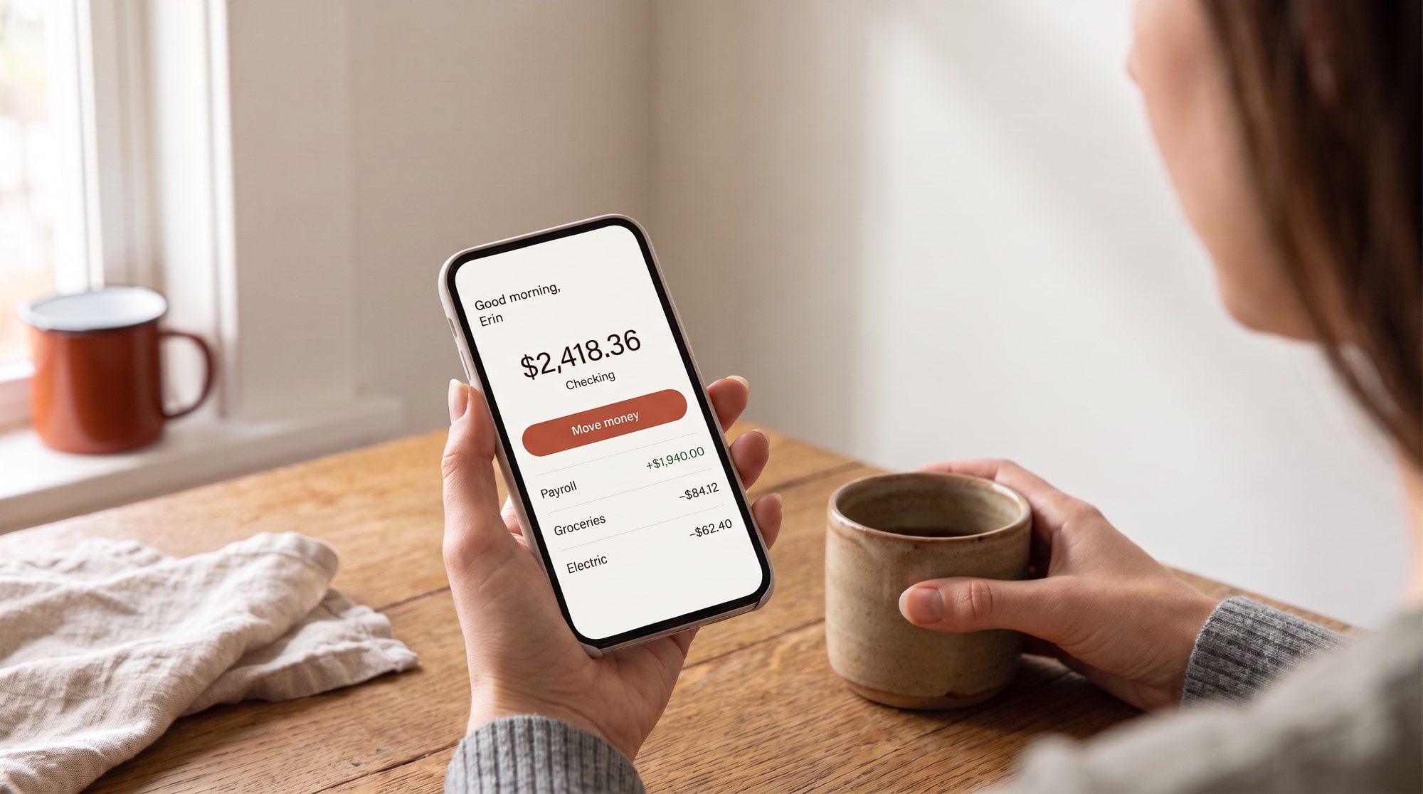
Juniper Front's old app had a 2.1-star rating and members who said so. The launch line for the new one was three words long, because the members already knew the rest.
38%
of Juniper Front's 61,000 members active on the new app within 90 days. That's 23,180 people. The credit union's own plan said 20%.
The problem
Members had already decided the app was bad.
Juniper Front is a 61,000-member credit union with eight branches between Fort Collins and Castle Rock. Its old app was slow, logged people out mid-transfer and had a 2.1-star rating with a lot of reviews explaining why.
The new app was good. That wasn't the problem. The problem was that members had a firm opinion, and roughly four in ten of them were over 55 and perfectly happy walking into a branch. A launch that only reached the people who'd switch anyway would stall at the plan's 20%.
What we did
We didn't pretend the old one was fine.
Say the true thing.
"It works now" ran everywhere: branch windows, statements, email, paid social, the ATM screen. Members laughed at it, which meant they read it. It also told them the credit union had been listening, without a paragraph about listening.
The tellers carried it.
We wrote a two-minute switch for branch staff. Download, log in, move one saved payee, done. We filmed real Juniper Front tellers doing it with members, unscripted, for short videos that ran in branches and online. A member over 55 believes a teller they know before they believe an ad.
Nothing to set up twice.
We pushed the product team to carry saved payees and recurring transfers into the new app. Then we wrote the onboarding around that: "Your payees are already here." It was the line that moved older members most.
Paid by segment, not by age.
Spend went to members by what they did, not who they were. People who called the member line about login problems got the app first. People who used the branch for transfers got the teller videos.
It works now.
The launch line
Branch windows, statements, email, paid social and the ATM screen. Three words, everywhere a member already looked.
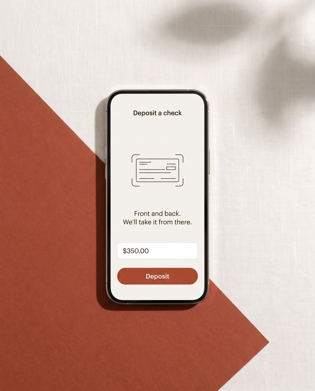
The words inside the app
We wrote the in-app copy too. Error messages included. "That didn't go through. Your money didn't move. Try again." is longer than "Error 402," and it's what members needed to read.
Error 402That didn't go through. Your money didn't move. Try again.
The launch line was three words long because the members had already written the rest of it.
What happened
Nearly double the plan, in one quarter.
The branches are still open. Fewer people are standing in them to move $200.